Custom Stole Embroidery: Fonts, Threads & Artwork That Reads Clean
Custom Stole Embroidery: Fonts, Threads & Artwork That Reads Clean
A graduation stole is read from across an auditorium, in motion, for about three seconds. That is why custom stole embroidery lives or dies on legibility — the font, the thread color, and the artwork have to carry meaning at a distance and on camera. A gorgeous design that turns to mush from row 20 defeats the purpose. Getting embroidery right is the difference between a stole that pops in every photo and one that reads as a blur.
This guide covers the fonts that stay legible, the thread and contrast choices that make lettering pop, and how to prep artwork so custom stole embroidery comes out crisp.
Fonts that read from the back row
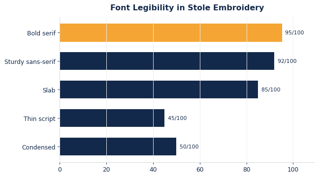
The best custom stole embroidery uses clean, medium-weight fonts — classic serifs and sturdy sans-serifs — at a generous size. Ultra-thin scripts and tightly condensed type look elegant on a screen but disappear in thread, because embroidery has a minimum stitch width below which letters fill in or fray. As a rule, favor simple letterforms and give them room.
Size matters as much as style: a name or program across the stole should use letters tall enough to read at a distance, which usually means fewer words, larger. The chart scores common font styles on embroidered legibility.
Keep the message short
Great stoles say one or two things clearly — a program name and year, a Greek chapter, a role — not a paragraph. Editing the copy down is the single biggest improvement most designs need. If you must include more, use a hierarchy: one large primary line, one smaller secondary line.
Thread color and contrast
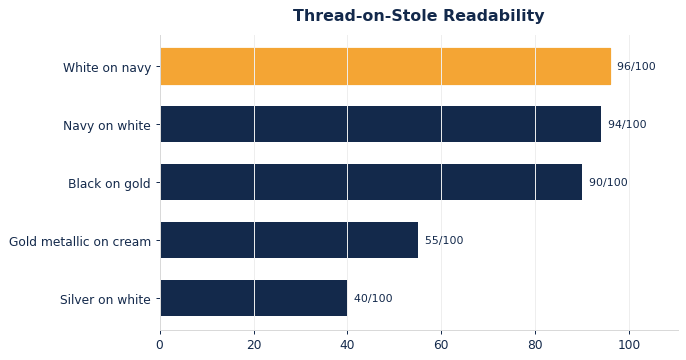
Contrast is what makes embroidery legible. Metallic gold and silver look celebratory but can wash out against light stoles or under stage lights; a solid, high-contrast thread (white on navy, navy on white, black on gold) reads far more reliably. Use metallics for accents — a seal border or a small flourish — not for the main lettering.
Match thread to the stole color deliberately, and remember that busy backgrounds fight with text. The chart shows how thread-on-stole combinations rank for readability.
Prepping artwork for clean stitching
Embroidery is stitched from vector art or a digitized file, not a photo. Send logos and seals as vector where possible, simplify fine detail, and flag the exact thread colors you want. The table lists the prep steps that keep custom stole embroidery sharp.
| Element | Do | Avoid |
|---|---|---|
| Type | Medium-weight, few words, large | Thin scripts, tiny text |
| Color | High-contrast main thread | Metallic for body text |
| Logo/seal | Vector, simplified detail | Low-res photo, hairlines |
A quick proof confirms size and contrast before the full run. To see how these choices play out on a full order, read our companion Military & ROTC Graduation Stoles: A Custom Ordering Guide, and browse stole styles across our custom graduation stoles range.
Designing for motion, distance, and the camera
A stole is almost never seen static and up close; it is seen swinging as a graduate walks, from twenty rows back, and through a phone camera. Custom stole embroidery has to survive all three, which is why generous size and high contrast beat clever detail every time. Before approving art, shrink it to a thumbnail on your phone — if the words blur at that scale, they will blur on stage and in every photo a family treasures.
Balance the composition so the eye lands where you want. A common mistake is cramming a seal, a name, a year, and a tagline onto one panel until nothing stands out. Give one element clear priority — usually the program or organization name — and let the others play supporting roles at smaller sizes. Whitespace around the lettering is not wasted; it is what lets embroidery read cleanly instead of fighting a crowded background.
Mind the fabric and the stitch density, too. Satin stitch gives letters a smooth, reflective sheen that photographs well, but very large filled areas can pucker a lightweight stole, so a good digitizer balances coverage against the material. Confirm your exact thread colors against the stole color under bright light, since stage and camera lighting exaggerate low contrast. A quick stitched proof settles all of this before a full run locks the choices in.
Match thread across a multi-stole order
If you are ordering matching stoles, specify thread colors by number, not by name. ‘Gold’ varies between suppliers; a thread number guarantees every stole in the batch reads identically.
Working with a digitizer to protect your artwork
Embroidery does not print your file; it re-creates it as stitches, and that translation is done by a digitizer who decides stitch type, direction, and density. The quality of custom stole embroidery depends heavily on that step, so treat the digitizer as a partner rather than a black box. Send clean vector artwork, name your exact thread colors, and flag which element is the priority, so the person mapping stitches knows what must stay crisp if something has to be simplified.
Understand the trade-offs a good digitizer will raise. Tiny text below a minimum stitch height fills in and becomes a blob, thin script lines fray, and dense fills on a light stole can pucker or bleed the fabric’s weave through. Rather than fighting these limits, adjust the design to work with them: bump up type size, thicken hairlines, and convert a delicate script to a sturdier letterform. A digitizer who pushes back on a risky detail is protecting your result, not being difficult.
Always insist on a stitched proof for a first run or a new design, not just a digital mockup. A screen preview cannot show how thread catches light, how a color pairing actually contrasts, or whether a filled seal puckers the stole. Approving a physical sample — and keeping it as the reference for reorders — is the step that guarantees the embroidery you picture is the embroidery that ships, stole after stole, year after year.
What to hand your supplier
To get custom stole embroidery that reads clean, hand your supplier a tidy package: clean vector artwork, thread colors specified by number rather than name, a note on which element is the priority, and a one- or two-line message edited down to what truly matters. Ask for a stitched proof rather than a screen mockup, review it at thumbnail size on your phone, and keep the approved sample as the reference for reorders. That short discipline guarantees the lettering you picture is the lettering that ships, crisp on stage and in every family’s photos.
Frequently asked questions
What font is best for stole embroidery?
A clean, medium-weight serif or sturdy sans-serif at a generous size. Avoid ultra-thin scripts and condensed fonts, which fill in or fray when stitched small.
Is metallic thread a good idea?
Use it for accents, not main lettering. Metallics can wash out under stage lights; a high-contrast solid thread reads far more reliably from a distance and on camera.
Designing custom stoles?
Send your text and artwork and we’ll proof embroidery that reads clean from the back row.